
Retirement options planner
This project aimed to improve the usability of the existing Retirement Planner, making it easier for customers to understand their options at retirement.
Project role: UX Design Consultant
Project length: 6 months
Project overview
The current L&G Retirement Planner was developed to illustrate the value of a customer’s pension and present the various income options available at their chosen retirement age. Over the past year, the planner has generated approximately 300,000 projections, with an average of 22,000 users engaging with the tool.
Despite these strong usage figures, customer feedback has been largely negative—primarily concerning the tool’s usability. As a result, Legal & General partnered with CTC to undertake a full redesign of the Retirement Planner to improve the user experience and meet evolving customer expectations.
Customer interviews
To better understand the challenges with the current Retirement Planner, customer interviews conducted by the project’s User Researcher were reviewed to uncover users’ retirement goals and priorities.
While participants expressed a range of hopes and expectations, two key themes emerged:
Financial Security
Customers want confidence that they can retire early or semi-retire, be mortgage-free, leave money to children or family, and live without financial stress.More Time
They aspire to spend more time with friends and family, pursue hobbies, and travel.
Usability testing
Customer interviews were complemented by usability testing, conducted by the project’s User Researcher. This phase focused on understanding:
How and why users engage with the Retirement Planner
How easy and useful the planner is to navigate and interpret
What specific information helps users make informed decisions
Key Recommendations from Testing:
Provide the option for users to input additional pension pots they may still be contributing to
Present headline figures in a way that satisfies both high-level and detail-oriented users
Improve copy clarity to ensure messaging is easily understood
Clearly break down annual income, especially when it comes from multiple sources
Simplify graph designs to make the data more instantly digestible and visually accessible
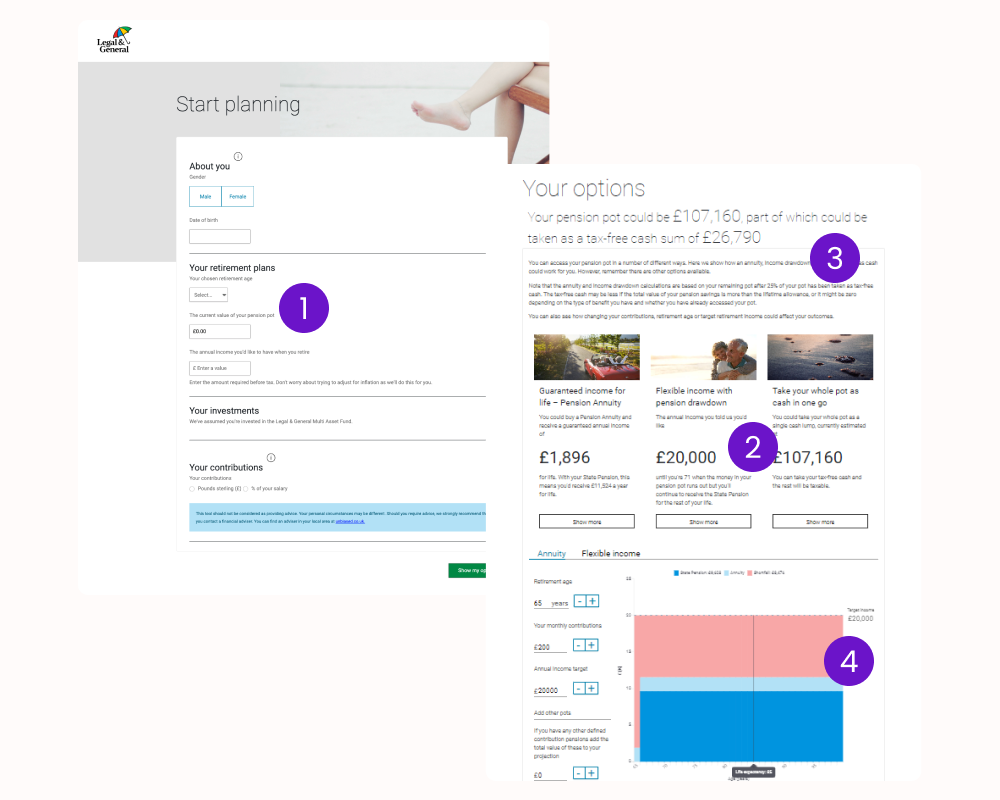
Initial design sprint
A rapid redesign sprint was conducted based on insights from user research. The updated concepts were tested with participants to validate that the project was heading in the right direction and addressing the key issues identified in the original Retirement Planner.
What Worked Well:
Clear breadcrumb navigation showing steps in the journey
Users preferred typing/selecting values over sliding scales
Positive feedback on links to Retirement Living Standards and suggested figures
Areas for Improvement:
Introduce a dedicated stage for retirement savings, combining pots and contributions
Move the state pension toggle earlier in the journey
Add a summary of user inputs on the results screen with options to review/edit
Include a direct link for L&G customers to update their policy
Add a stage for other sources of retirement income
Reassess the pie chart, which only works for a single-year snapshot—consider a better approach for displaying income over time
If there's a shortfall, suggest actions to close the gap (e.g. increase contributions, retire later, lower income target)
Clearly indicate whether the customer is on track or not, to provide immediate clarity
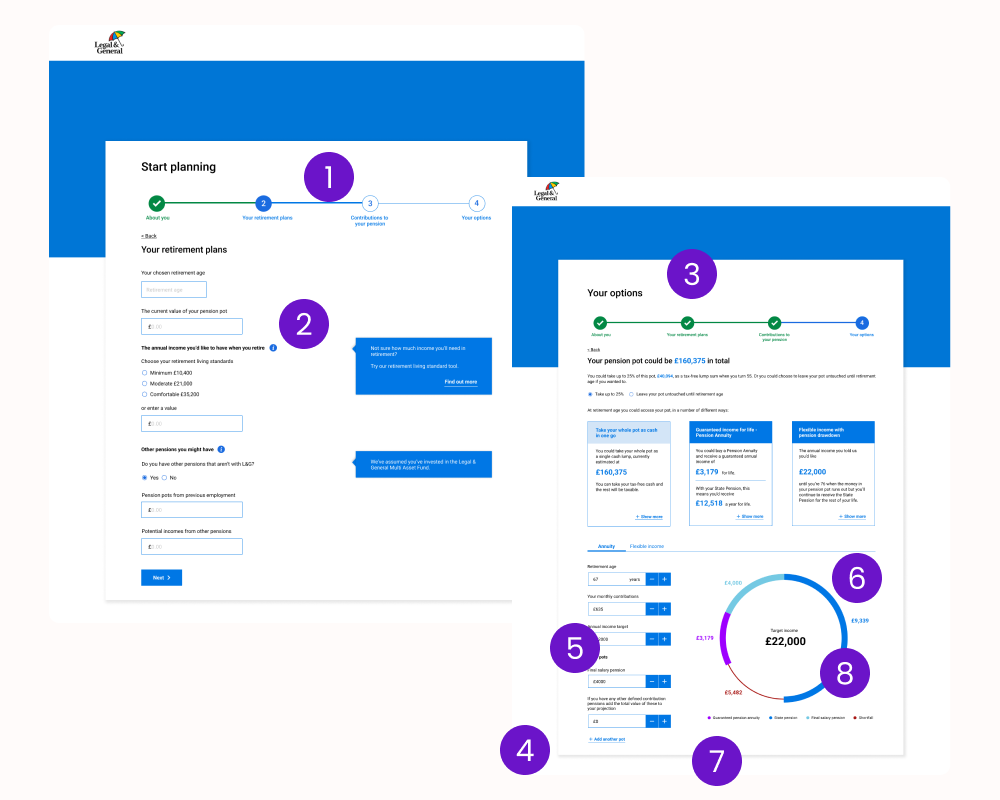
Initial design sprint
Following the initial design sprint and user testing, an iterative process was adopted to progressively align the design with user feedback from earlier testing rounds. The team began by stripping the interface back to a simple greyscale UX journey, allowing usability testing to focus purely on functionality rather than branded visuals.
Additionally, usage data highlighted the importance of mobile accessibility, prompting a mobile-first approach to ensure the Retirement Planner performed seamlessly across all devices.
Key Recommendations from Early Testing:
Reconsider how retirement options are presented to improve clarity
Simplify the results screen by reducing content and visual noise
Initially collapse “Your Details” and “Edit Plan” input fields to minimise scrolling
Let me know if you'd like help drafting the next stage of design improvements or preparing this for a sprint review.
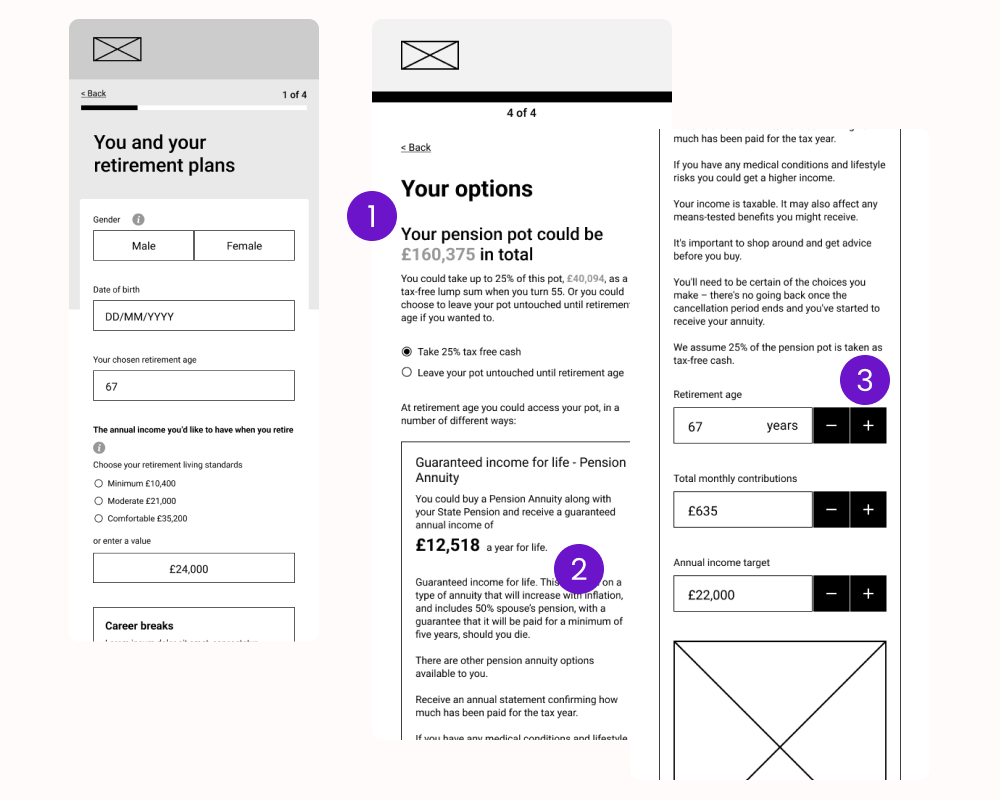
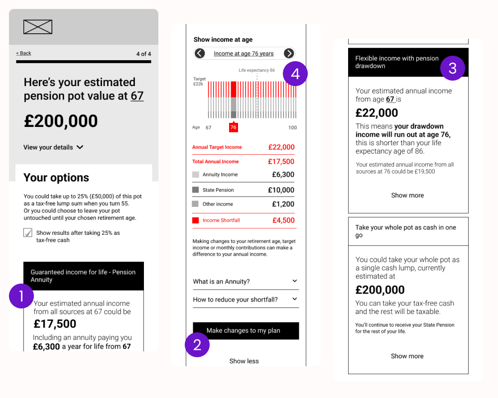
Further user testing
The most recent round of design and user testing incorporated the recommended changes while aligning with the L&G design system—ensuring the updated visuals were appropriate for stakeholder and compliance review.
Key Improvements:
Simplified language supported by contextual help text where needed
Improved information hierarchy for income options, making them easier to compare
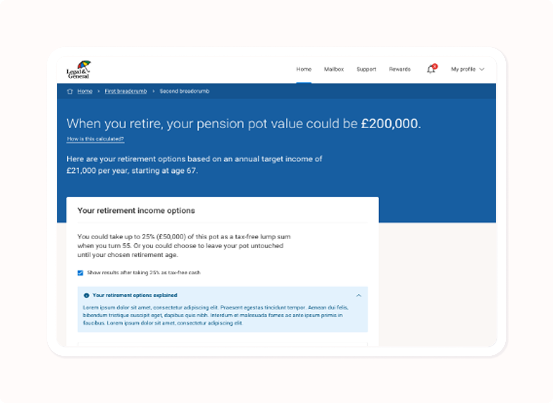
A clearer, more defined chart highlighting if and when an income shortfall may occur
Project outcome
The redesigned Retirement Planner significantly improved the user experience for Legal & General customers. With a cleaner, more intuitive interface and a mobile-first approach, customers were able to navigate their options with greater ease and confidence.
Key benefits included:
Enhanced customer understanding and engagement: Clearer language, contextual help, and simplified charts made it easier for users to grasp their retirement outlook and take informed action.
Higher conversion and completion rates: More customers completed the planning journey and made decisions based on their results.
Fewer customer support queries: Improved usability reduced confusion and cut down on the volume of calls and questions from users.
Stronger brand perception: Meeting WCAG AA standards and incorporating modern design principles reinforced L&G’s image as an inclusive and customer-focused provider.
Improved compliance and transparency: The updated journey ensured users had access to the information they needed to make responsible financial decisions, supporting regulatory standards.
Overall, the project delivered measurable value to both L&G and its customers—proving the impact of a thoughtful, research-led design process.
